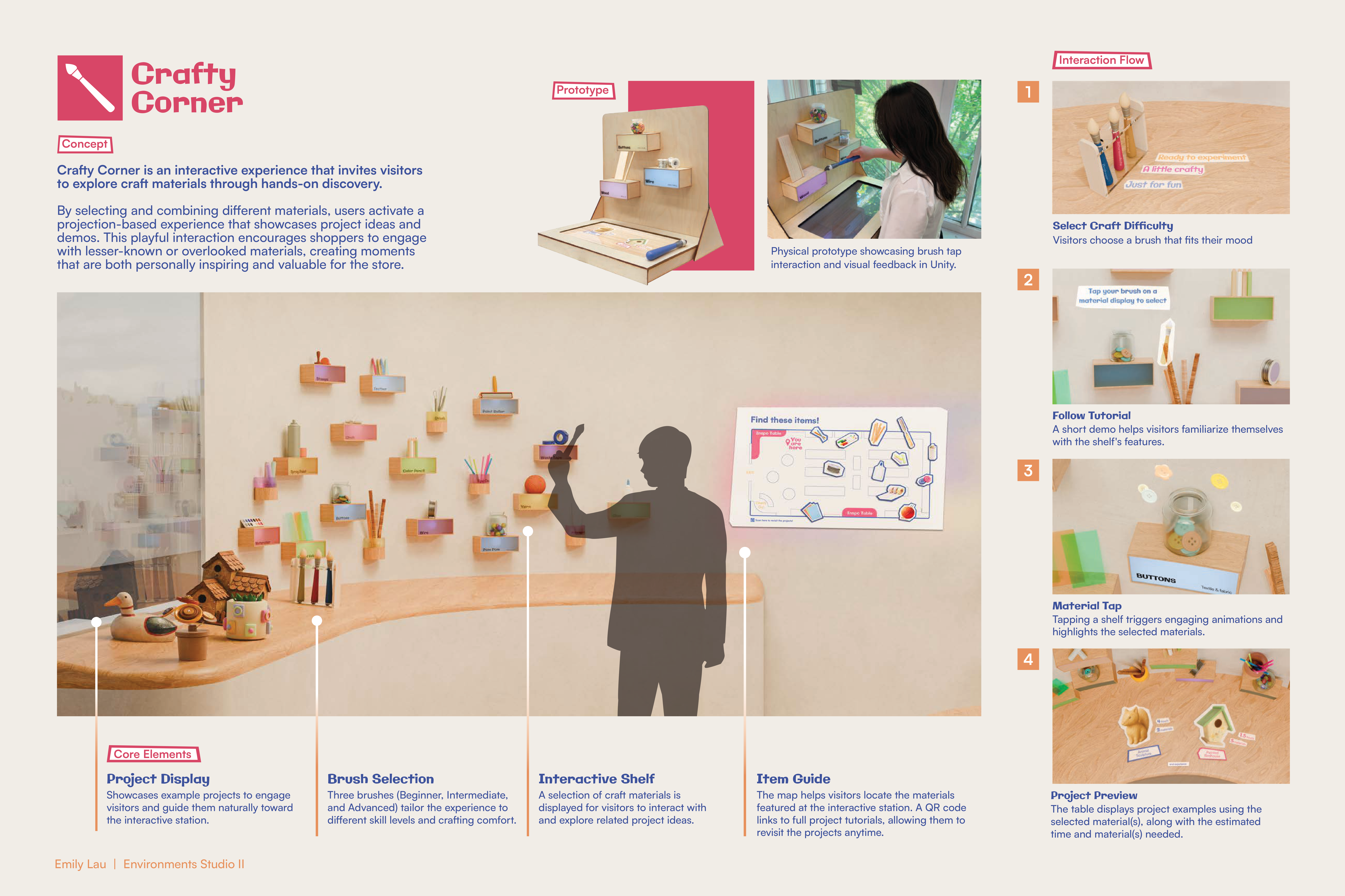
Crafty Corner
Explore craft materials through hands-on discovery
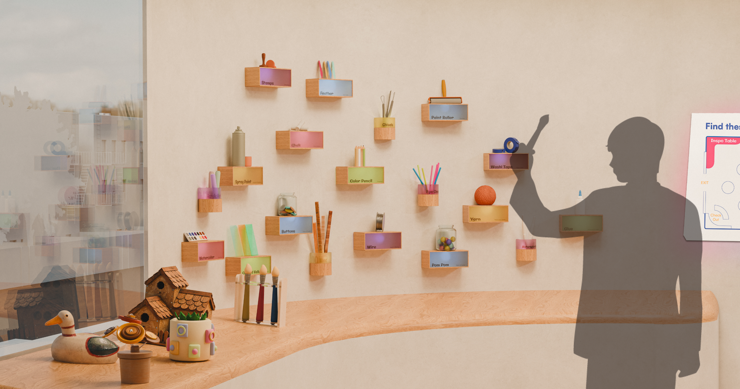
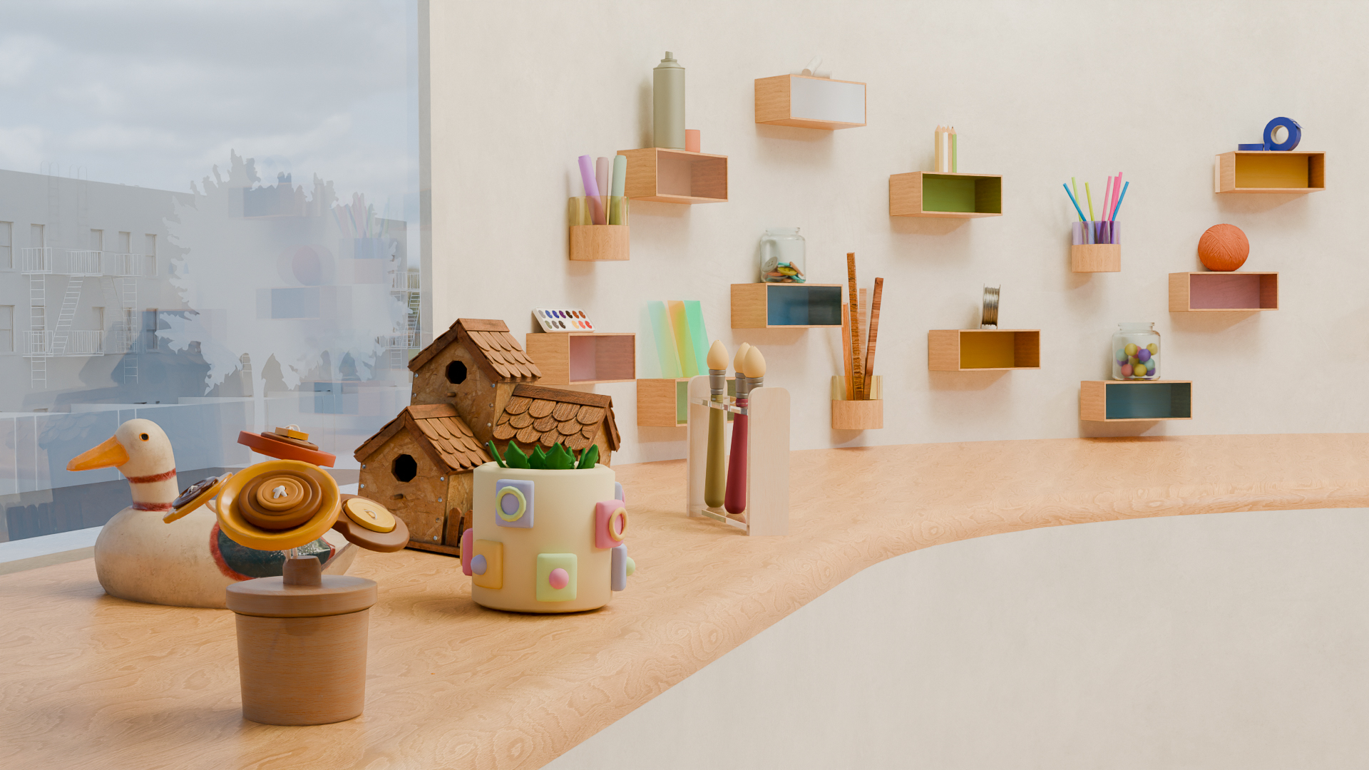
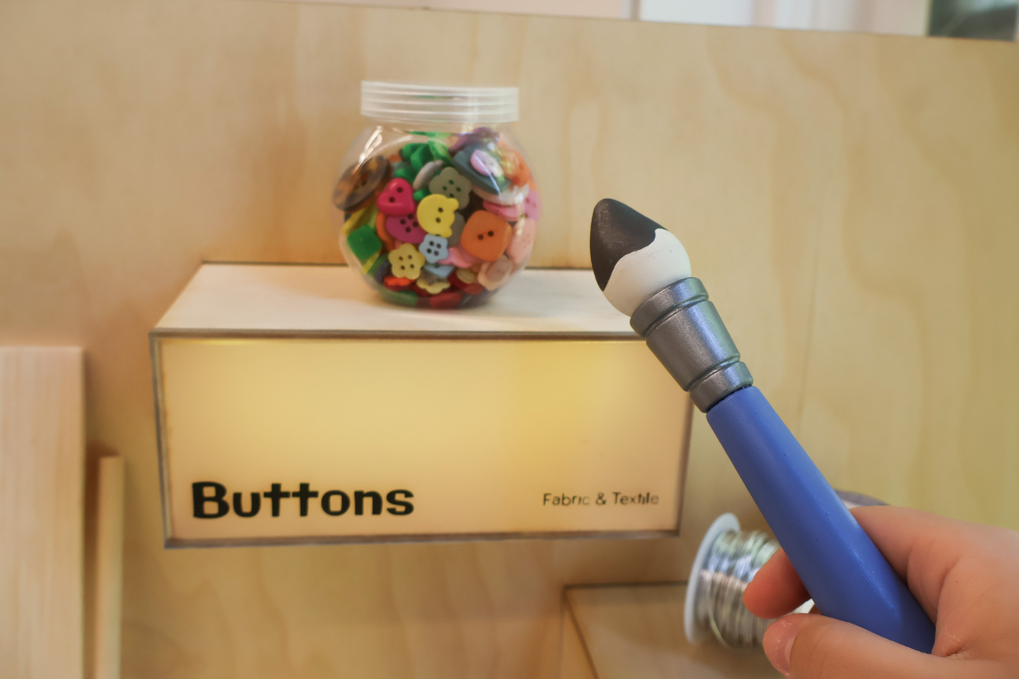
Designed for art store environments, this interactive experience reimagines how people explore craft materials using a custom built paintbrush and sensor embedded shelves. When a visitor taps the brush on different materials, the setup triggers projected visuals, sounds, and tutorials that explain what the materials are and how they’re used. This system makes unfamiliar tools and techniques feel more approachable and highlights overlooked craft materials in the store.
Individual
8 weeks, Spring 2025
Sole Designer
Unity, Blender, Arduino, Illustrator, Photoshop, After Effects, Premiere Pro, Rhino, Figma
Interactive art-store experience designed to make exploring products feel more approachable.
Showcases example projects to engage visitors and guide them naturally toward the interactive station.
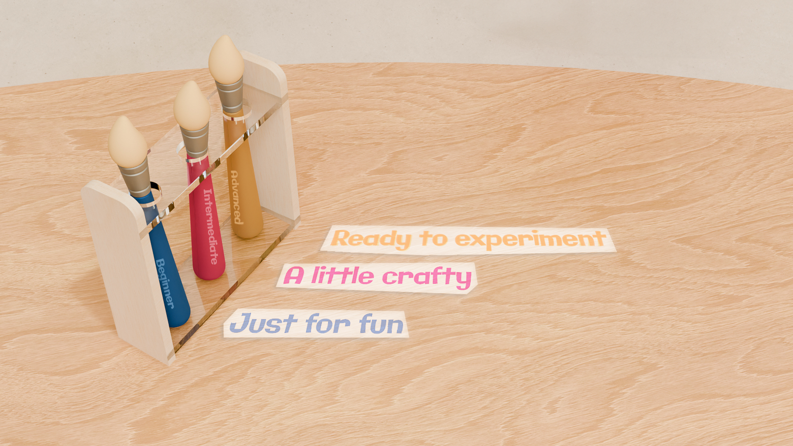
Visitors choose a brush that fits their mood.
.gif)
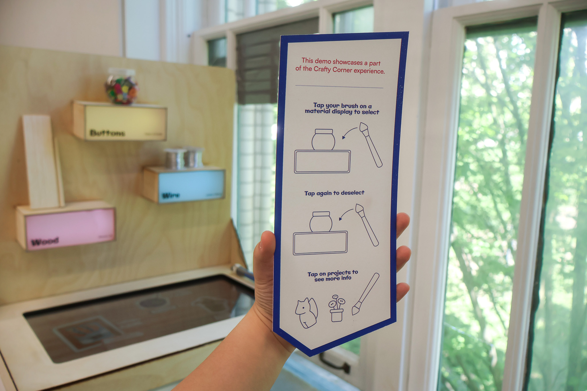
A short demo helps visitors familiarize themselves with the shelf's features.
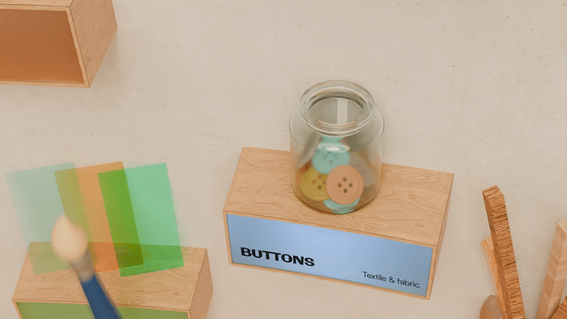
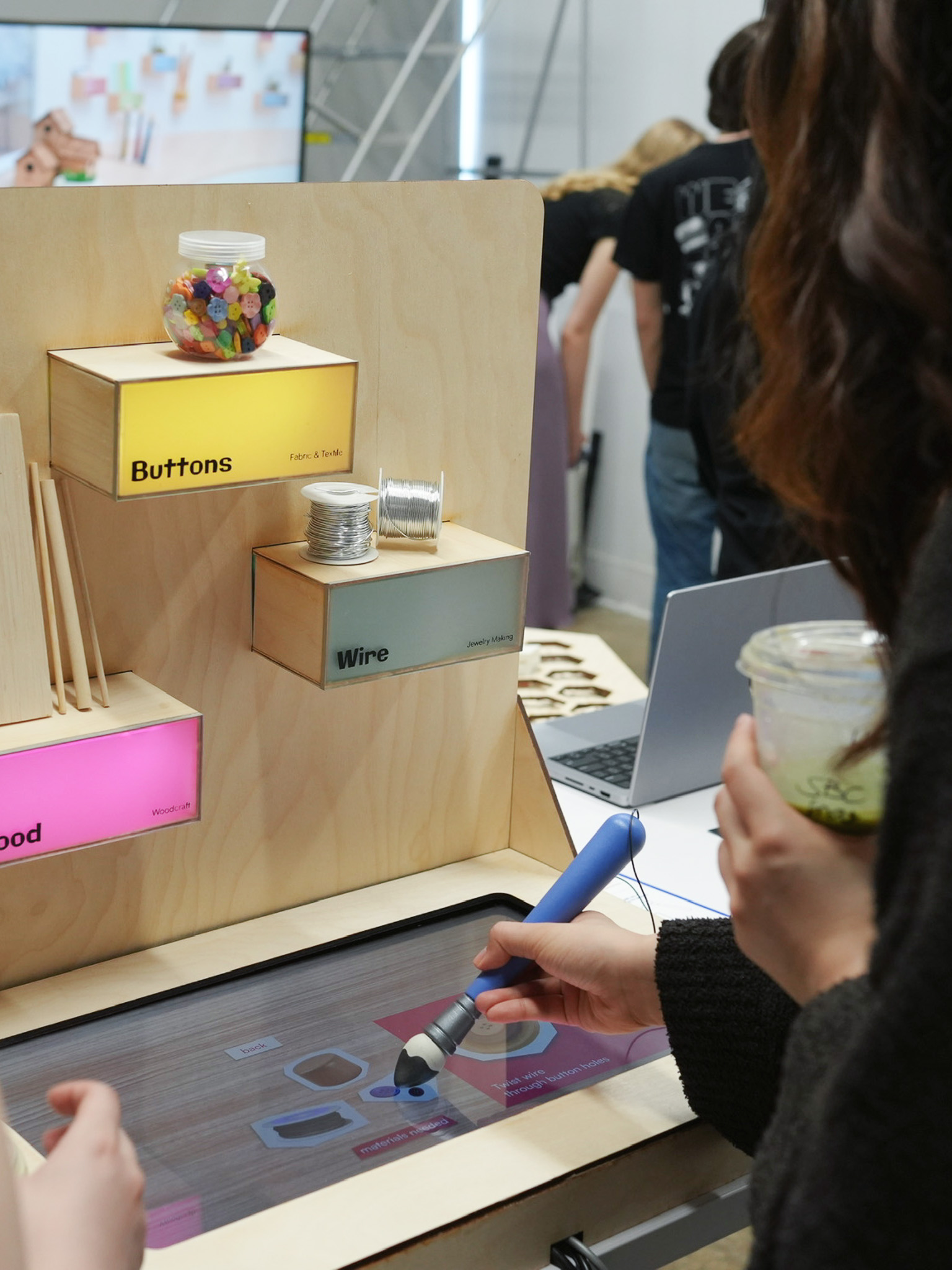
Tapping a shelf triggers engaging animations and highlights the selected materials.
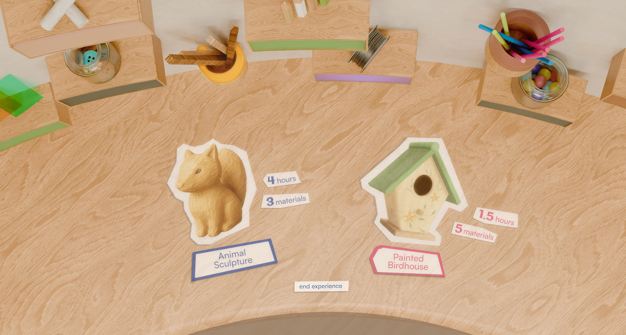
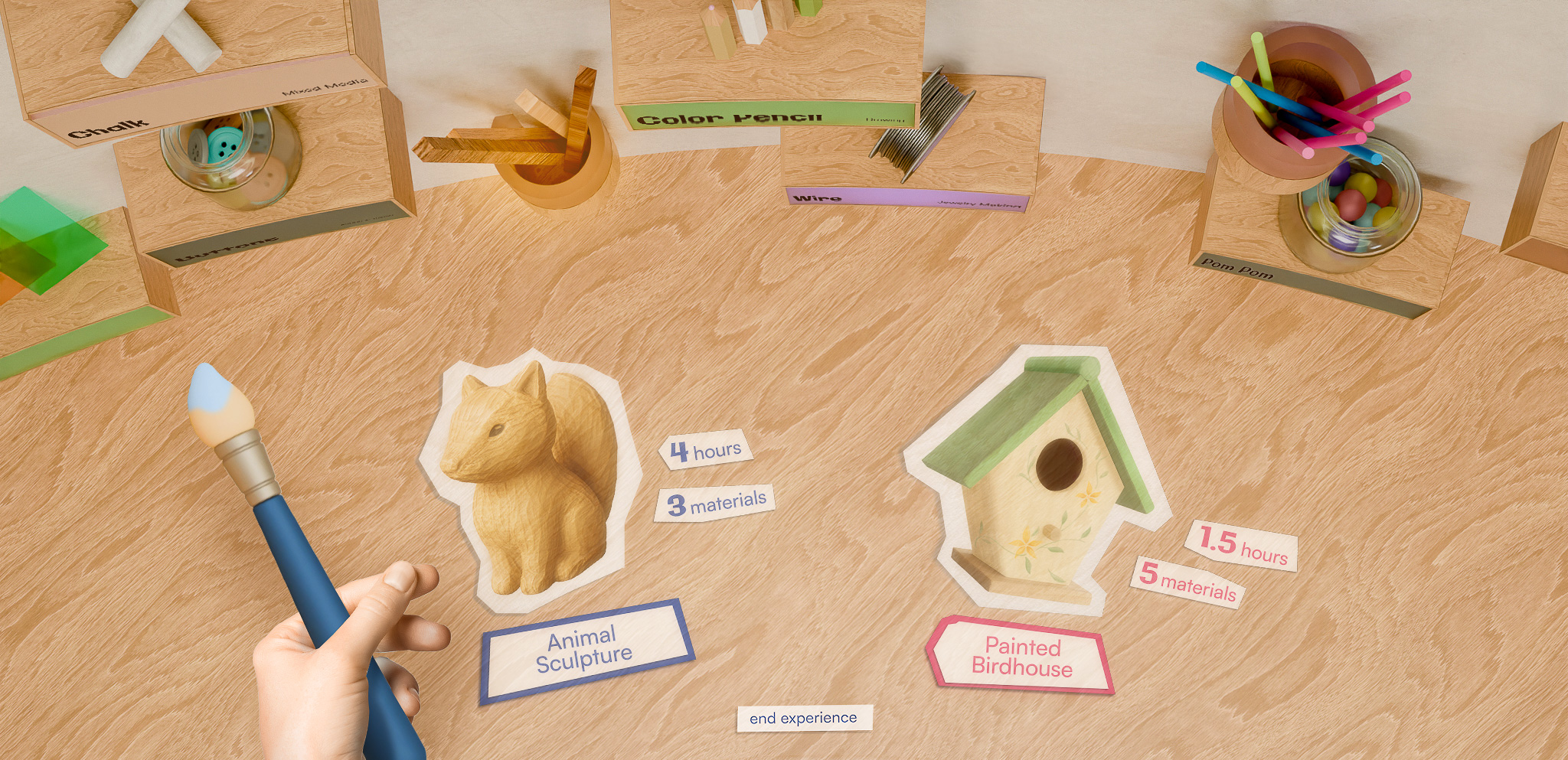
The table displays project examples using the selected material(s), along with the estimated time and material(s) needed.
.gif)
Select a project to view a quick walkthrough and a checklist of required materials.
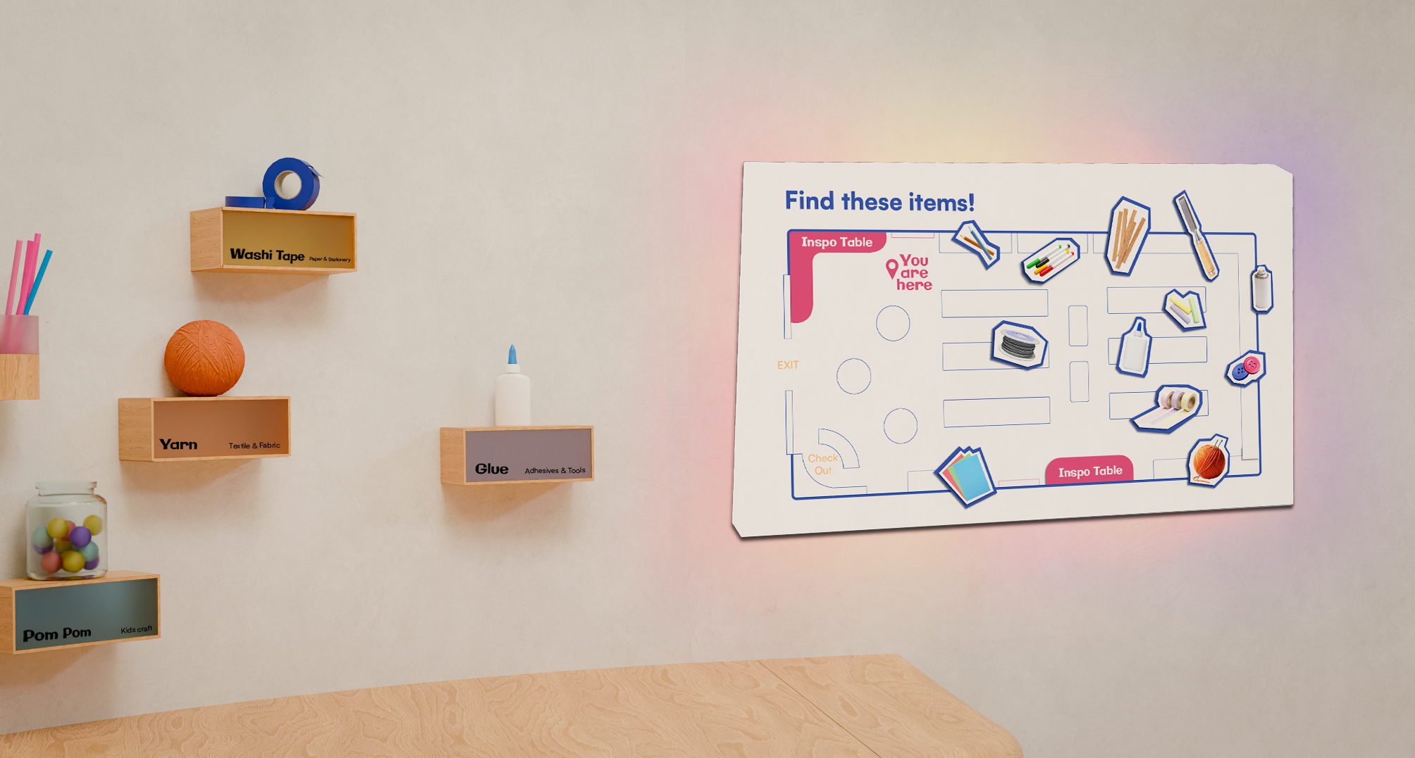
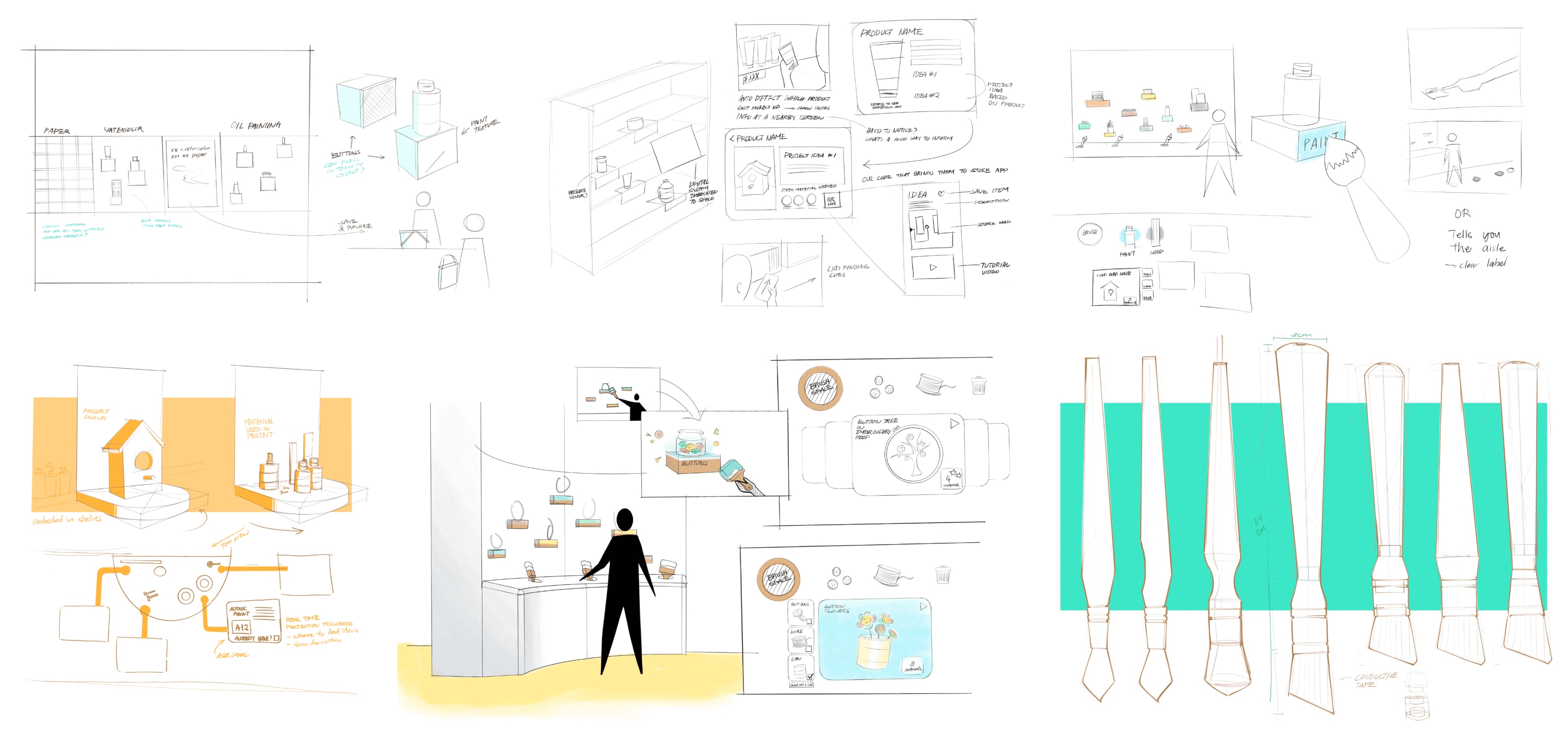
The map helps visitors locate the materials featured at the interactive station. A QR code links to full project tutorials, allowing them to revisit the projects anytime.
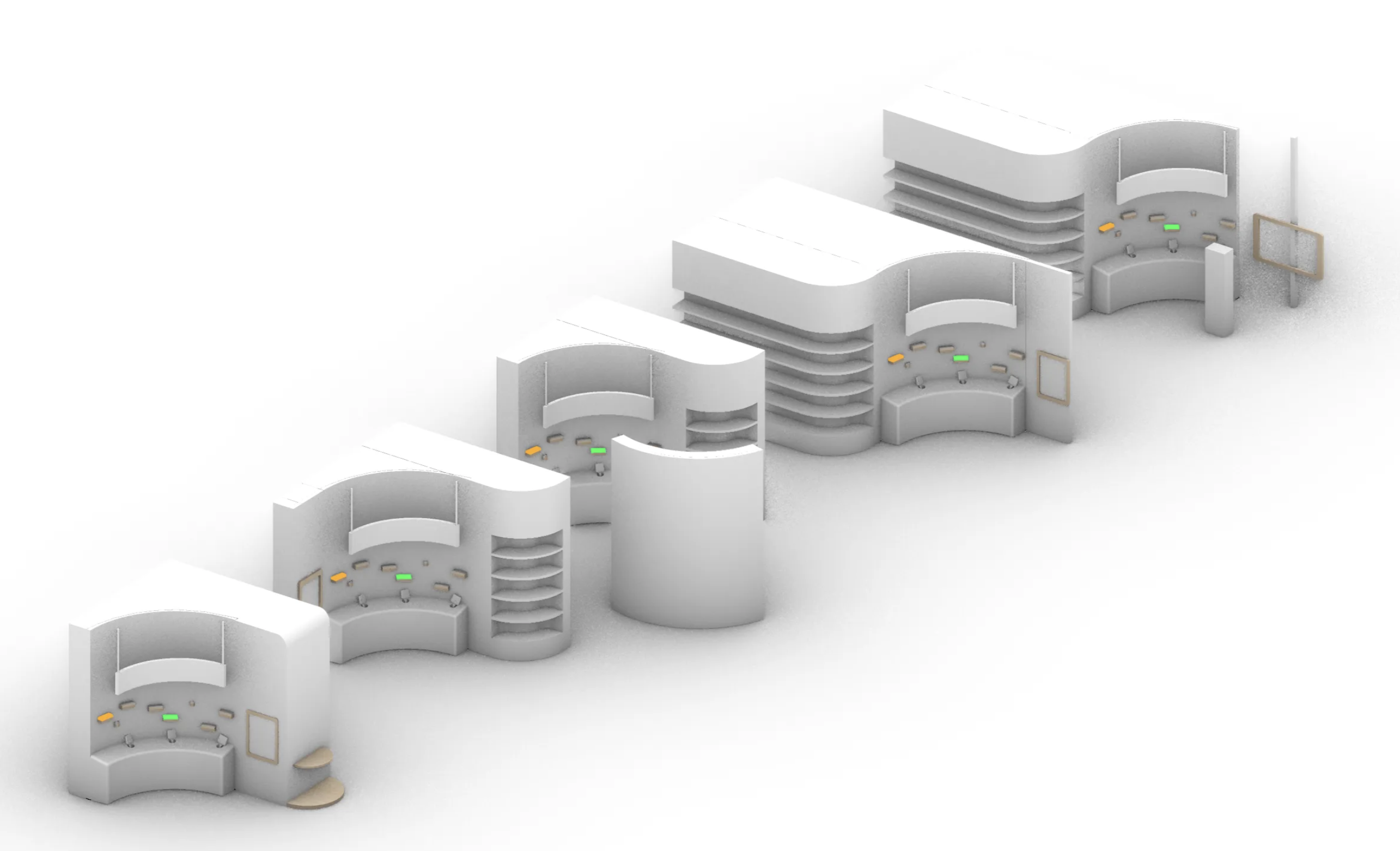
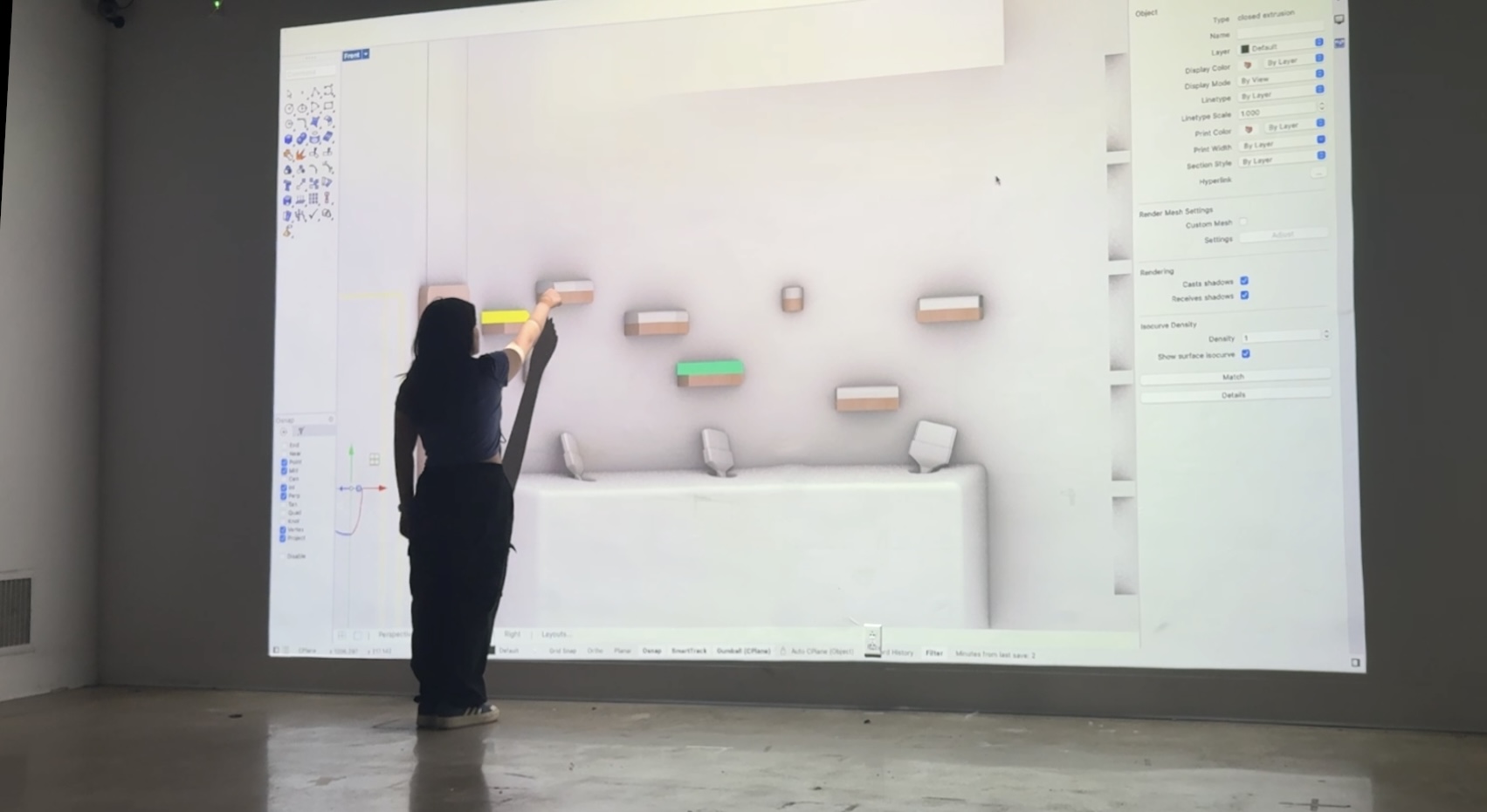
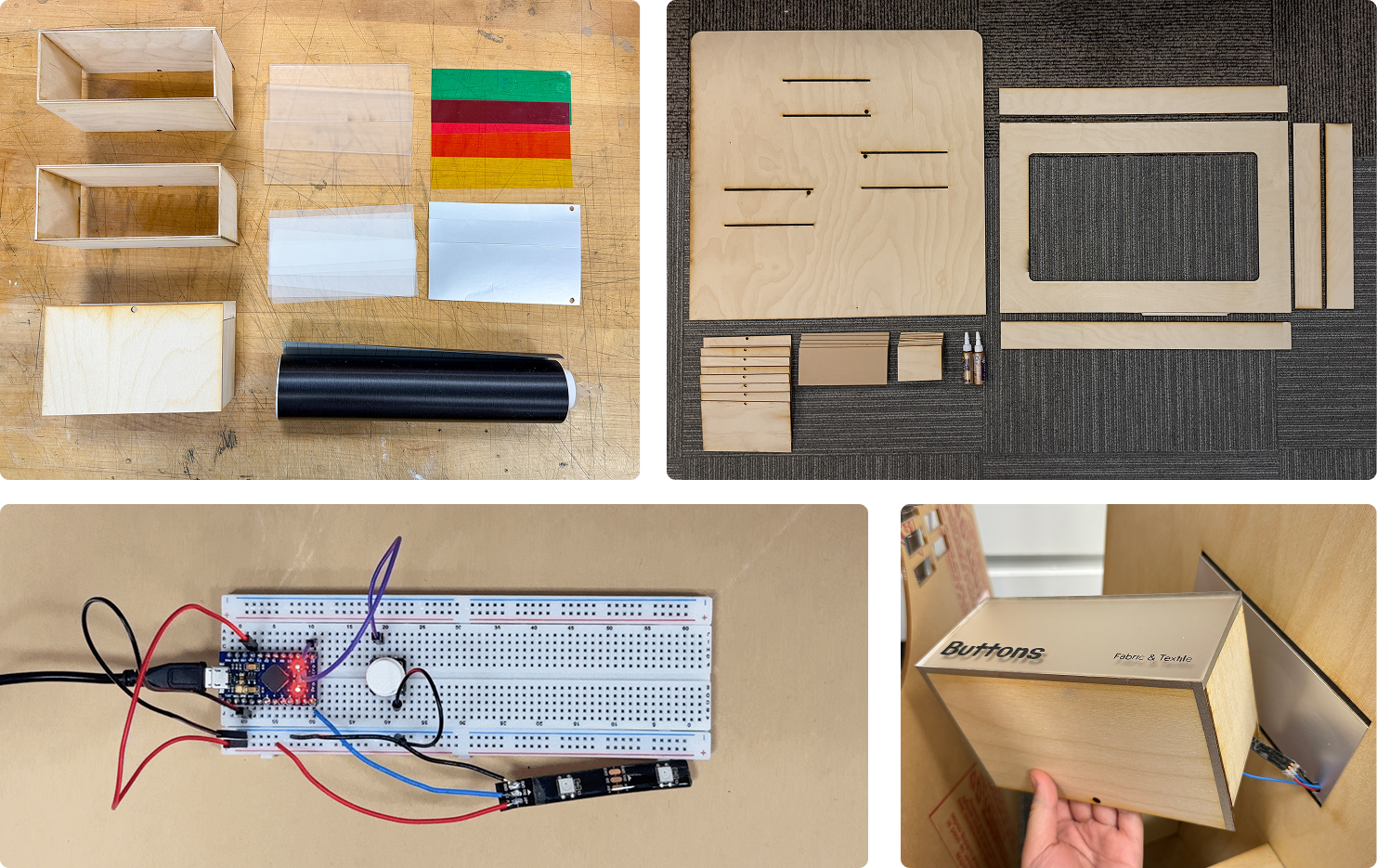
This demo features three laser-cut interactive shelves and a 3D-printed conductive paintbrush. Touching the brush to a shelf completes a circuit, triggering embedded LEDs and sending a signal to Unity to display content on a touchscreen.
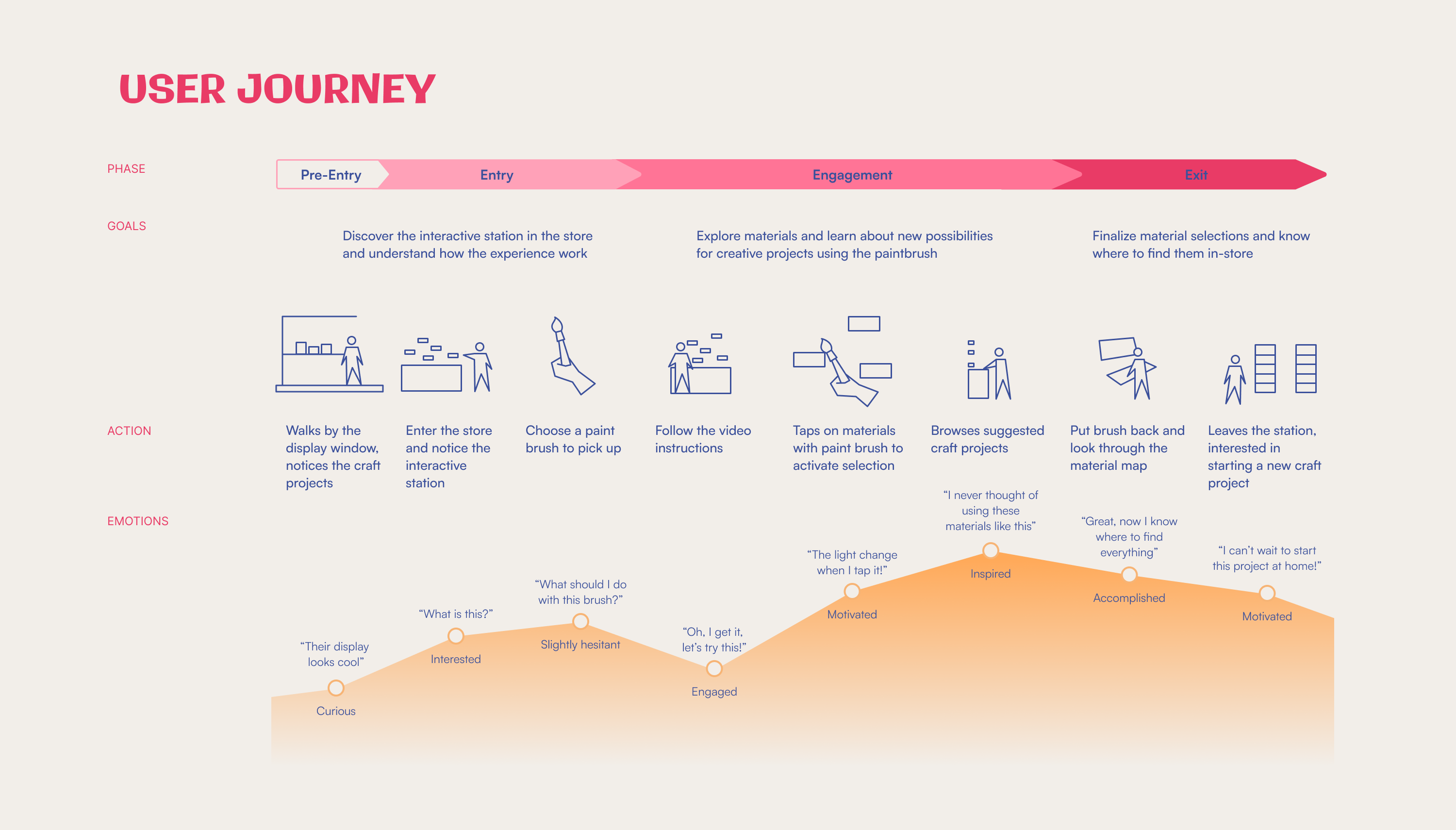
Multiple person mentioned that while items are typically grouped by category, the number of options can still feel overwhelming, which often leads to hesitation when trying unfamiliar materials.
A store employee mentioned that even clearly displayed products often go unnoticed—especially the ones that aren't immediately familiar or easy to understand.
Items are often grouped in ways that hide useful associations, making it harder for customers to discover related tools or materials.
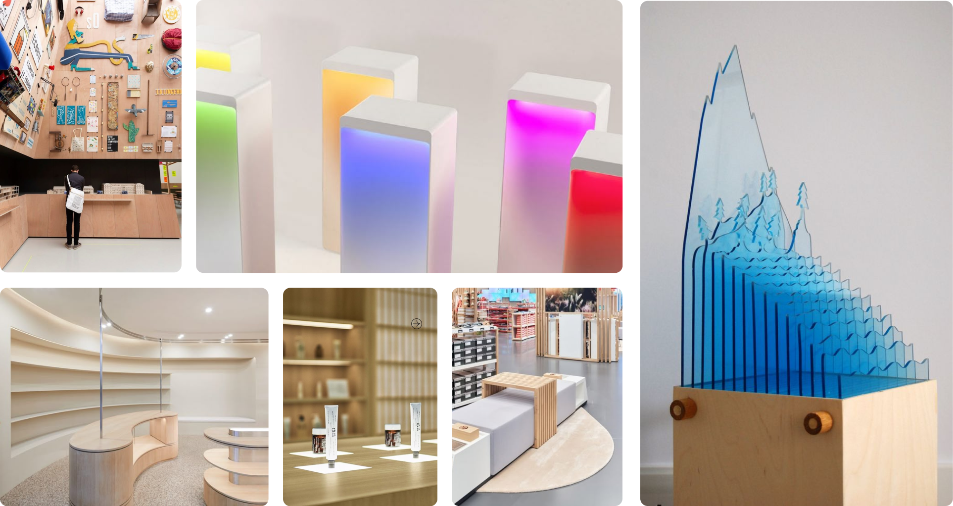
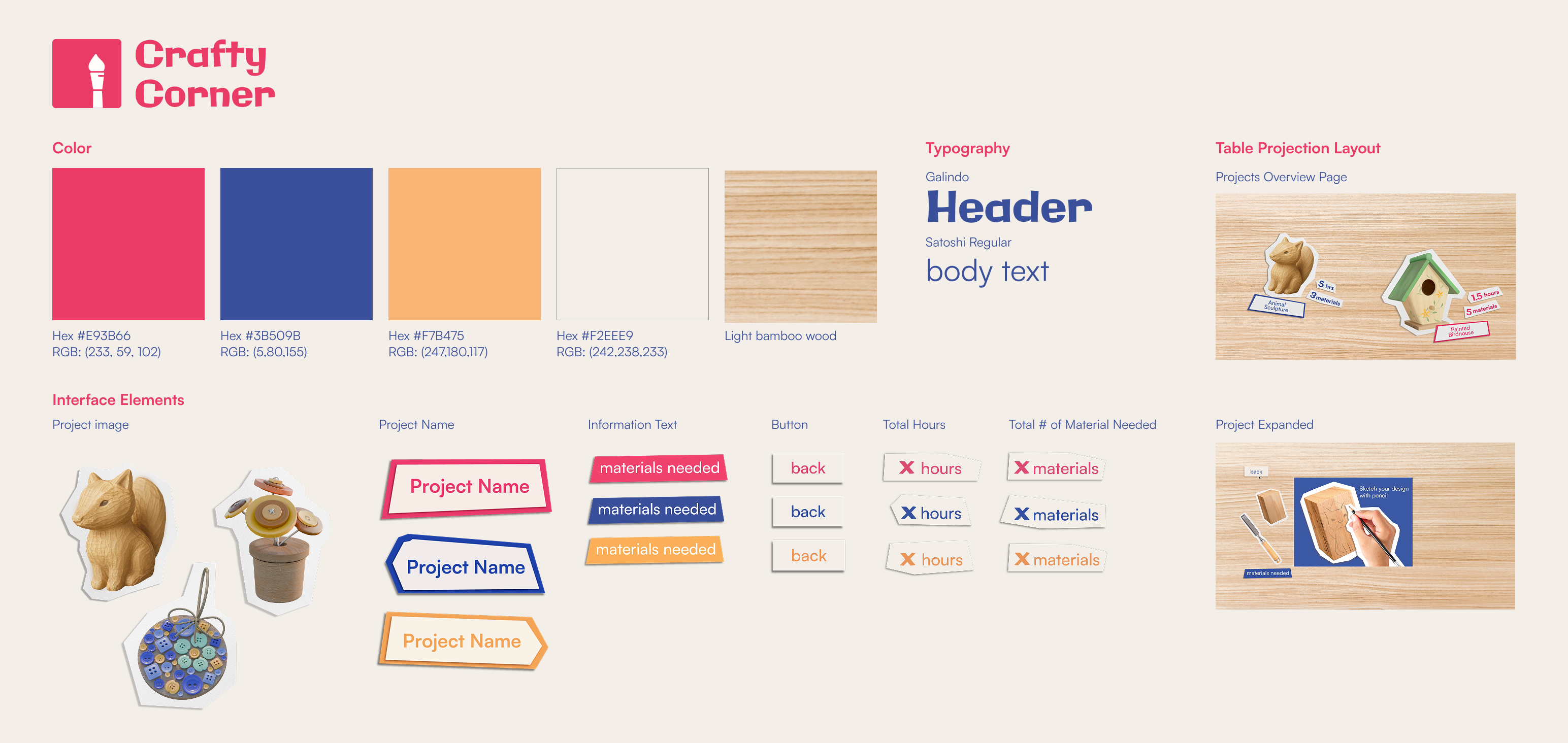
Light wood tones paired with colorful acrylics and embedded LEDs
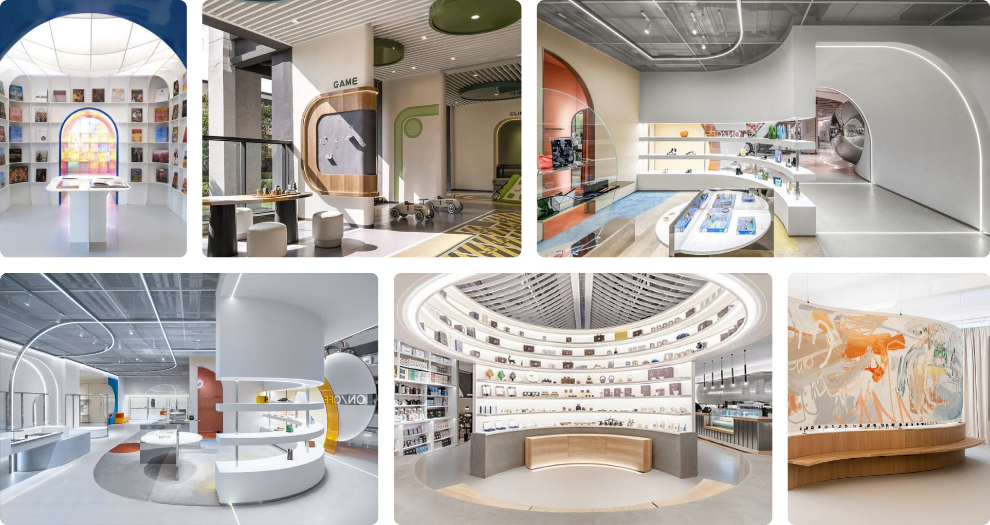
Wide uncluttered layouts with curved shelving and walkways
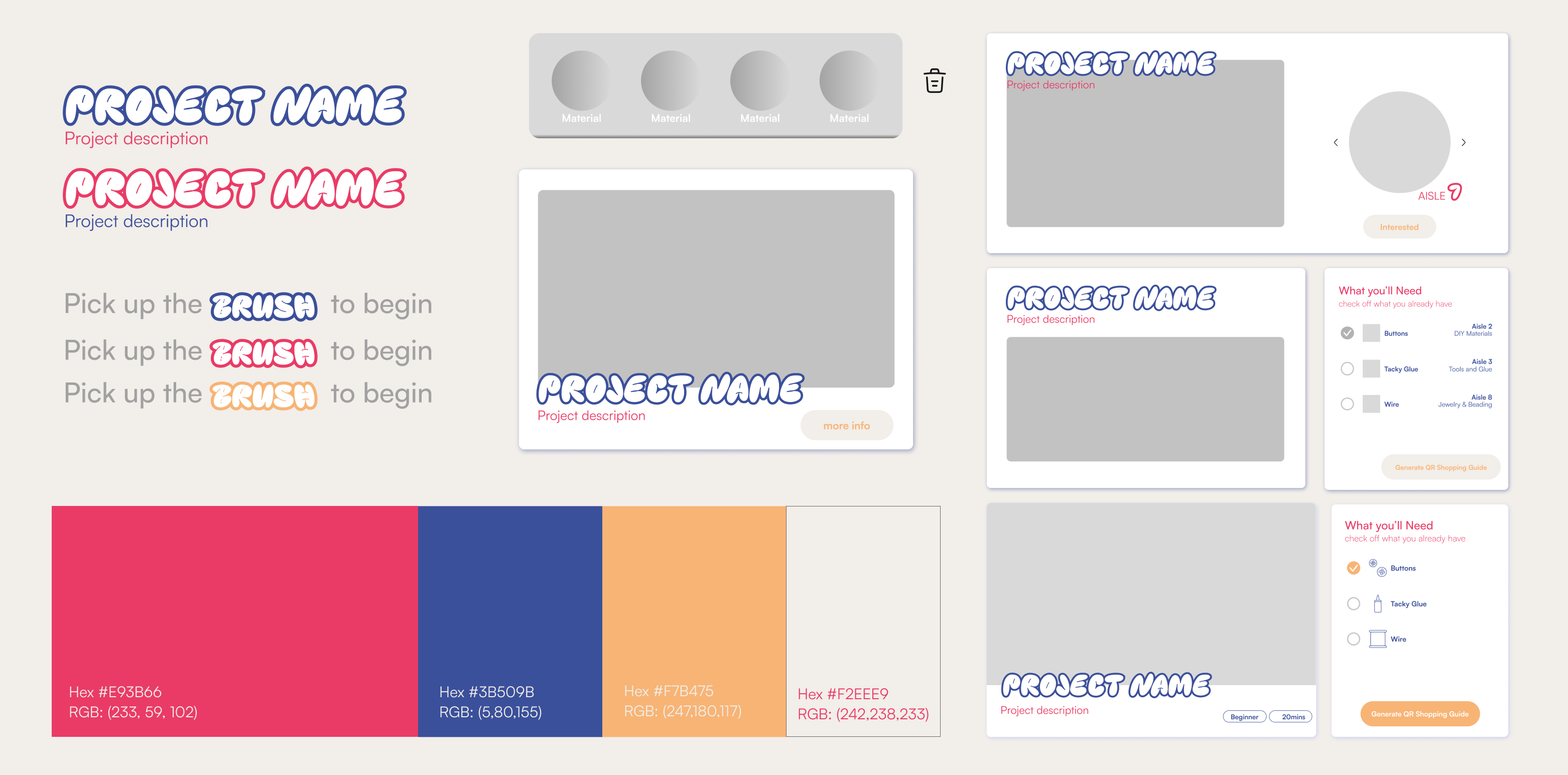
Crafty Corner’s branding takes inspiration from a crafter’s table. I replaced standard buttons by paper cutouts to reduce the intimidation of digital interfaces. With just two main screens, the interaction stays simple and approachable.
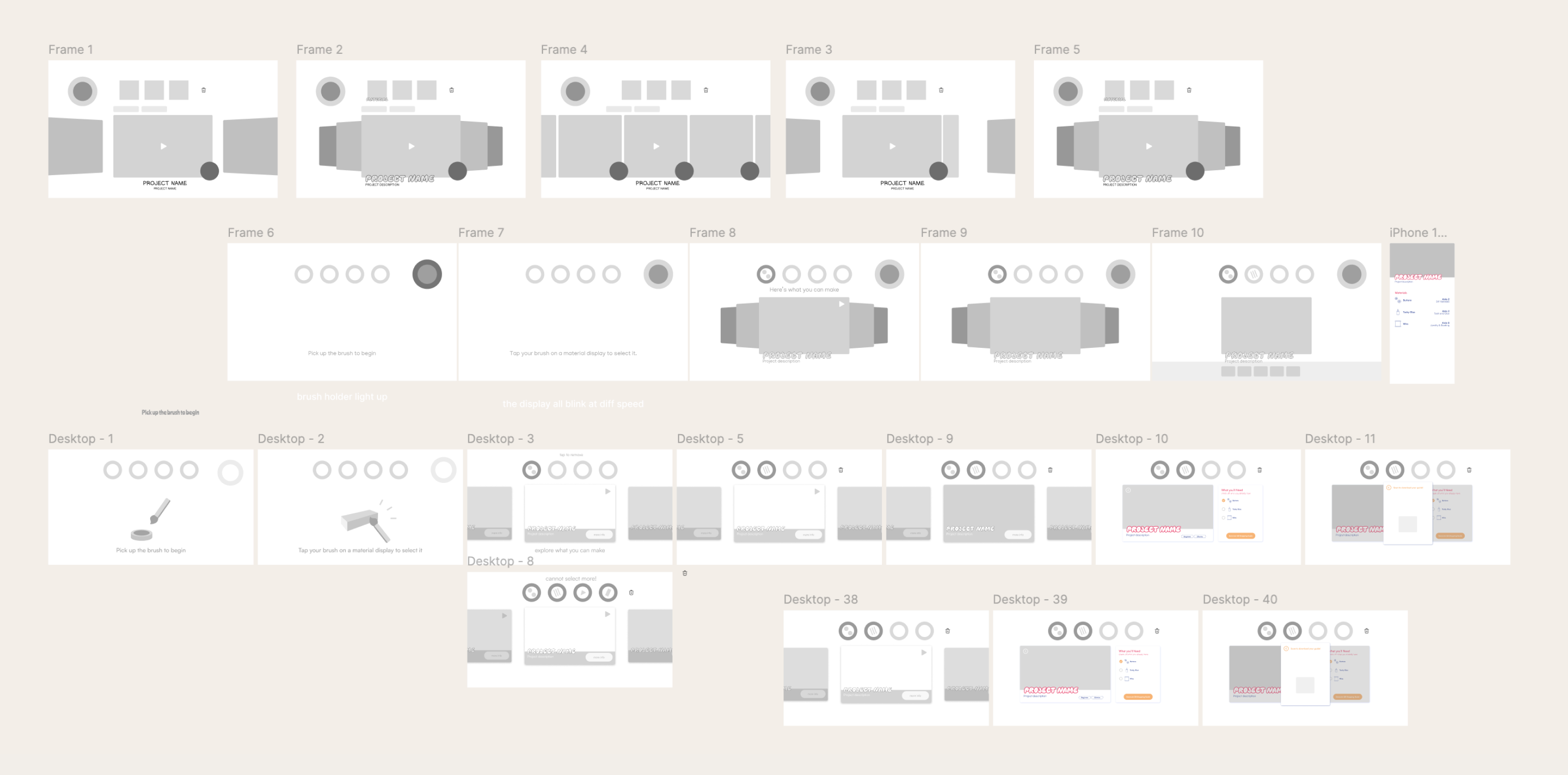
My initial approach was very screen-based, with too many UI elements competing for attention. It felt too cluttered and overwhelming, both visually and interactively.


.gif)
.gif)